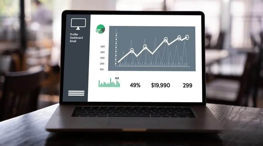
Power BI dashboards are a powerful tool that can be used to visualize and analyze data in a meaningful way. They are an interactive, visual representation of data that allows people to explore and gain insights from their data. Dashboards can be used to track and monitor key performance indicators (KPIs), identify trends, and gain insights into business operations.
Power BI dashboards are built upon the Microsoft Power BI platform. This platform allows users to create interactive and custom visuals using data from various sources, such as Excel, SQL Server, or the web. The visuals can be combined into a single dashboard which allows the user to see their data in one place. The user can then interact with the dashboard, drilling down into the data to gain insights. If you need detailed information about power BI sales dashboard examples, visit the official website of Datacamp.
The following are types of Power BI dashboards:
1. Sales Dashboard
This dashboard tracks sales performance over time. It includes a bar chart that shows sales by month and a line chart that shows sales by product.
2. Marketing Dashboard
This dashboard tracks marketing performance over time. It includes a bar chart that shows marketing expenses by month and a line chart that shows marketing leads by source.
3. Customer Service Dashboard
This Power BI Dashboard tracks customer service performance over time. It includes a bar chart that shows customer service tickets by month and a line chart that offers customer service response time by day of the week.
4. Website Traffic Dashboard
This Power BI Dashboard tracks website traffic over time. It includes a pie chart that shows website traffic by source and a line chart that shows website traffic by day of the week.
5. Global Stock Market Dashboard
Power BI Global Stock Market Dashboard is a tool that enables users to visualize and analyze global stock market data in real-time. The Power BI Dashboard is powered by Microsoft’s Power BI technology which allows users to easily monitor, analyze and report on a variety of financial information.
Top 5 Power BI Dashboard examples are as follows:
A detailed explanation of some Power BI dashboards examples is given below-
1. Sales Dashboard

Power BI Sales Dashboard | Neonpolice
Power BI Sales Dashboard is a powerful tool that allows businesses to visualize sales performance data and analyze trends in sales. It provides users with an interactive dashboard that displays sales performance metrics in real-time. This allows users to track and analyze sales performance and make data-driven decisions to improve sales.
The Power BI Sales Dashboard also provides users with the ability to customize their dashboard. Users can adjust the metrics they want to view and the format they want to view them in. This allows users to tailor their dashboards to better suit their needs.
2. Marketing Dashboard

Dashboard also provides marketers with the ability to create custom reports and dashboards | Neonpolice
Power BI Marketing Dashboard also provides marketers with the ability to create custom reports and dashboards. This feature allows marketers to quickly and easily create customized reports and dashboards that provide a more detailed look at their marketing data. For example, marketers can create a dashboard that includes data from multiple sources, such as social media, web analytics, email marketing, and more. This allows marketers to quickly and easily compare their performance across multiple channels.
Power BI Marketing Dashboard also provides marketers with the ability to create alerts and notifications. This allows marketers to immediately be alerted when certain thresholds are met or exceeded. This helps marketers quickly respond to changes in performance and optimize their campaigns.
3. Customer Service Dashboard

Customer Service Dashboard offers a variety of features, such as customer service KPIs | Neonpolice
The Power BI Customer Service Dashboard offers a variety of features, such as customer service KPIs, customer service trends, customer service analytics, customer service insights, customer service scorecards, and customer service performance metrics. It also provides customer service drill-down reports, customer service insights, and customer service analytics.
The Power BI Customer Service Dashboard is an effective tool for customer service teams to identify areas of improvement and implement strategies for customer service improvement. It allows businesses to track customer service performance, identify areas where customer service can be improved, and make informed decisions about changes that need to be made.
4. Website Traffic Dashboard

Website Traffic Dashboard is designed to give businesses quick and easy access | Neonpolice
The Power BI Website Traffic Dashboard is designed to give businesses quick and easy access to their website analytics. It provides a comprehensive and interactive view of the website traffic data, which can be used to analyze the performance of the website and its content. The dashboard allows businesses to track key metrics such as page views, unique visitors, page views per visitor, time on site, and bounce rate. The dashboard also includes an interactive map that allows businesses to view their website traffic across different countries, states, and cities.
5. Global Stock Market Dashboard

Global Stock Market Dashboard | Neonpolice
The Power BI Global Stock Market Dashboard is a comprehensive and interactive tool that provides users with the ability to view global stock market data in real time. The dashboard provides a range of features that allow users to track the performance of individual stocks and global stock markets, including:
- Global Market Summary – A snapshot of the global stock market performance, including the top 10 global markets, and the performance of each market over the past week, month, and year.
- Stock Performance – A detailed breakdown of the performance of individual stocks, including their opening and closing prices, daily highs and lows, volume, and other important metrics.
- Market Sectors – A breakdown of the different sectors of the global stock market, including technology, finance, healthcare, and other major industries.
- Stock Alerts – The ability to set up custom alerts that will notify users when a certain stock reaches a certain price or when it hits certain performance thresholds.
Conclusion
Overall, Creating a Power BI dashboard requires some technical knowledge and experience with the platform, but it is relatively easy to get started. Once the data is imported and the visuals created, the dashboard can be configured to be interactive and informative. For more information about power bi financial dashboard examples, visit the official website of Neonpolice.


