
Contrasting print pairing may appear intimidating, but it’s much simpler than it sounds. Continue reading for some pointers and guidelines to assist you in getting started with mixing prints or advancing to the level of a pro.
We have all heard the proverb “don’t mix your prints,” which is an old one. Many of us are still scared to try this risky look, though. It’s undoubtedly a look that will get some notice, but the rules of fashion have changed.
Celebrities are changing the game every day by wearing mismatched prints. Although power struggles might not be your thing, do not worry! You can still embrace this style without combining patterns that are drastically at odds. Just adhere to a few basics.
Know your Pattern:
When it comes to mismatched prints, it is crucial to your pattern amongst the many different options you deal with during pattern mixing. Also, knowledge of many ideas and tactics for each print will surely be helpful to you as you design your upcoming wardrobe.
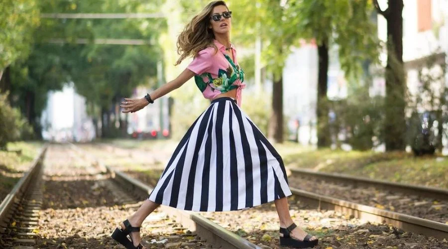
Stripes Pattern | Neonpolice
- Stripes
This print is well-known as one of the most basic prints, which is quite popular and an all-rounder amongst patterns. They are available in various thicknesses, orientations, and colors. Therefore, you should put them on cautiously. However, it would help if you considered them your new neutral as they look fantastic with polka dots.
- Animal Prints
These prints help the best way out by styling them with milder patterns. They will also give your look a wider side which works best if the print comprises natural colors.
- Houndstooth
This classic and ageless print can style with a single focal piece. Also, it is a terrific way to give your outfit some definition. This conventional black and white pattern will assist you in selecting the color of your other print. Moreover, it offers a work-friendly look with sleek black apparel. While teaming it with plaid or stripes will create a beautiful duo for your bolder look. However, the colors in this look should belong to the same family.
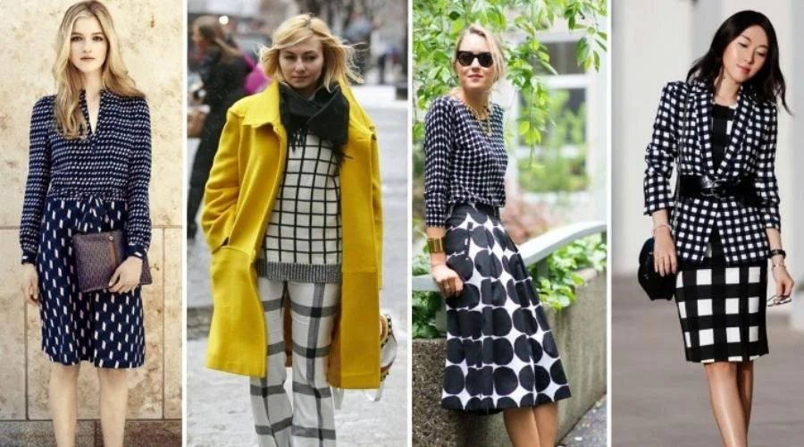
Stick To A Colour Pattern:
Mismatched Prints | Neonpolice
Ensure that the patterned items you’re pairing match at least a single color that unifies the entire design to achieve a sleek appearance. Mismatched prints that share the same tone attract the focus towards the pattern and the color pop, for instance, black and white, pink and grey, yellow and green, etc.
Spread Your Pattern across Your Outfit:
Try spreading the patterns more evenly throughout your outfit. Also, if you are not yet ready to clash patterns, wear one print on the top and the other on the bottom.
Adding Printed Accessories to your Outfit:
Simply start by adding accessories with patterns to an attire having some print. Utilizing a plaid scarf or a pair of leopard shoes is always a good thought.
Use Solids To Break Things Up
Mismatched Prints | Neonpolice
Teaming a solid-colored outfit with a busy one is the easiest way out. For instance, contrasting floral or tartan prints can be combined with an olive crop top. In the case of solid corduroy trousers, women can pair them with a printed top.
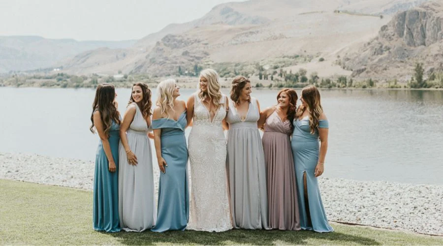
Pair Up Analogous Colors
Harmonious color combos naturally attract human beings. Therefore, a color wheel guides us in creating balance among colors.
In the color duo, periwinkle and lavender, the colors are adjacent on the color wheel. Hence, they have an analogous relationship and are perfect for a cohesive look. Also, it gives a neutralized appearance without going completely monochromatic. You can also make use of fabrics and textures, complimenting one another. For instance, soft floral print goes well with crushed velvety texture for a dreamy romantic look.
Use Complimentary Colors
It would help if you looked beyond complementary hues to create a strong statement with your wardrobe. These imply the colors present oppositely on the color wheel. Although the complementary color for pink is lime green, combining light pink with dark green adds more maturity to the look.
Using Same Pattern For Simplicity
Same Pattern | Neonpolice
Streamlining things by sticking to one print is a simple way to add some elegance to an inherently busy look. You can pair women’s plaid trousers or checkered pants with a checkered blouse to give a consistent look.
Stick To One General Color Scheme While Mixing
The usage of complementary hues softens the stark contrast among the patterns. For instance, a couple of floral print garments with hints of purple, pink, and blue make a summer outfit.
Use Same Color Saturation For Uniformity
Alteration of saturation takes place by mixing white, black, or grey. Therefore, using similar saturation colors gives more consistency. In contrast, it is teaming lesser saturated apparel with one having more saturation that results in attention towards brightly saturated one.
Same Color Family, Different Saturation Colors
Same Color Family | Neonpolice
This strategy will lead to the brighter color out of the two, to draw attraction. Therefore, surrounding a highly saturated color with muted colors allows the brighter one to stand out.
FAQs
Read more: Neonpolice.com